The Patterned Queen
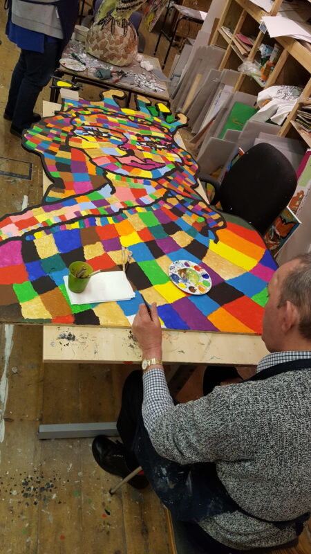
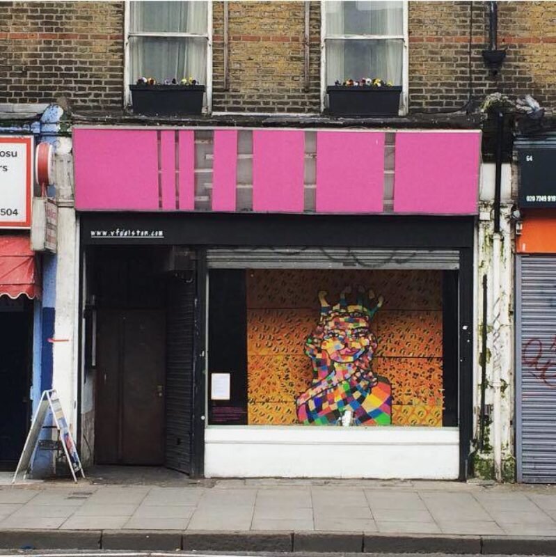
In 2018, studio artists Chippy, Stephen & Matt collaborated on an installation that was exhibited in the window of nightclub VFD in Dalston for a month. Fellow studio regular Billy documented the process as it unfolded.
It started with a blink. That’s how Chippy says yes or no. A day-service volunteer in the art studio was showing him pictures from a magazine, and the lady with the crown caught his eye. If I could say the rest was history, I would. But that would be a lie. Chippy’s pictures begin pretty much in the way described above, but their journey from start to finish is a story all by itself, a slow, rocky road from eye to hand to board and back the way you travelled last time, or maybe via a different route, with different sights to see with different travelling companions and a whole new set of bag-carriers.
Every ‘Chippy’ is a tactical leap of faith. Only good communication, a lot of love, and a masters degree in patience can pull it off. Each finished piece is actually a dialogue rather than a single voice. Watching studio boss Michelle coax Chippy in collaboration through a picture is one of my favourite pastimes. They have evolved a relationship in fondness akin to a longtime comedy duo, where a cutting look is forgiven in an instant and an easy adaptation to each other’s irritating quirks becomes effortless.
To then partner Chippy with one of the studio’s most commanding artists would, in most cases, be dismissed as one small step from insanity. Stephen Staunton – sometimes just ‘Staunton’, like Picasso or Rembrandt – always brings a massive presence to any room. Most people take a step back, wondering whether the correct response is fear or amazement. He is profoundly deaf, so his world is aggressively delimited but fine-tuned by all his other senses. There is a brutality about him that stops you in your tracks.
Separate and individual Chippy and Stephen may be, but what brought them together for this project are two primal elements of art: shape and pattern. A studio chat between manager Michelle Carlile and coordinator Alex Brady saw both of them flirting with ideas around pattern and brain injury. They noticed that many of the Submit to Love studio’s artists use pattern and shape by instinct, no professional prompting required. It is as if pattern and shape offer some kind of psychological anchor to a troubled and struggling mind. It sounded like a cliché waiting to be born, but it was worth exploring.
Stephen’s work, with its powerful geometry, fits this idea no problem. All the expression is in the colour and stroke. The pattern is the skeleton that holds the whole thing together. Chippy's work doesn't fit the pattern/shape idea so easily. Until you watch him at it. Chippy is unable to look straight ahead in a conventional way, so his peripheral vision has become acutely trained in compensation. It’s actually more like an extra sense. This is the sense with which he picks out shape and line.
There is a mountain of documentation behind this joint work. Its progress has been photographed at every stage and from every angle and a fearsome inventory of accreditation and consent compiled. Not only have both artists suffered brain injuries, they have been isolated further: Stephen with his deafness and Chippy, unable to speak and confined to a wheelchair. The task of making this happen was an ethical and logistical tightrope walk.
To complicate the project further would have amounted to an act of extreme self-punishment. But this is the hard-nose part. Because when you decide to exhibit a piece of art, to put it out there for the world to see, someone has to decide on context. This image was destined to appear in a shop window space in Dalston, east London, so how would it fit, and who are the passing viewers likely to be? What should the background look like? These are what I call 'engineering' decisions. They can make or break a project, but rarely is enough quality attention given to the preparation of the ‘environment’ in which the finished image will be displayed. Smelly pubs are full of great art that nobody pays any attention to.
When Matt Chappel agreed to join the project I was excited. Like Chippy and Stephen, Matt is severely limited physically, but I am fascinated by the intensity of thought he pours into his work. In action he looks like he is using art to work existentially through the trauma of his brain injury. I watch the line of his jaw tighten and I see his hand respond, sometimes gentle and sweeping, sometimes recklessly squirty and plunging. Matt’s paintings push you into switching from a comfortable position to one of high alert. This can be quite nerve-wracking.
Complex colour is a big part of Matt’s strength as an artist, so the decision to go for a leopard print background, with its typical abrupt contrasts of black/yellow/white/black could have failed badly. The background unit would comprise 12 rectangles pieced together to create a wall of pattern. Anything could happen between Phase 1 and Phase 12.
It wasn't until Matt had finished the first 'tile’ of 12 and had started on the second that I could envisage how brilliantly this was going to pan out. The speed with which he started fluently mixing the colours with his brush got faster and faster. Sometimes he was stroking the paint in a carefree manner, then he would poke agitatedly. Both methods succeeded in merging his chosen shades in the yellow/orange/beige/brown spectrum so that, when dry, a whole new tone formed itself. How the hell did he do that, I was asking myself continually. The addition of the black at the end was more an act of composition. Those spots form the eye-grabbers that move you around the whole space. They are points on a map.
Now set these two finished elements together, the queen’s head and the skin of a killer animal, and a flood of metaphor erupts in front of you. It’s hard not to attach the word KITSCH because that is exactly what it is, and shamelessly so. I can see the art of the three characters I sit with week after week. There they are: Chippy ambling and scratching, Stephen stabbing his kaleidoscope of colour and Matt putting in enough energy to power a rocket to Mars and back. It’s a classic case of the result being more than the sum of the individual parts, so you end up asking how can something so audacious possibly succeed? I stopped trying to answer that question after about five minutes and just stood back in amazement. It should never have worked, but it did. Leave it at that and just give thanks.
*Big thanks to art studio volunteer Brian for supporting the installation of this piece.


